
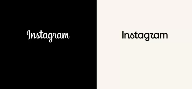
The evolution of digital identity: Instagram updates its visual signature
Instagram has rolled out a new redesign of its wordmark (text logo), marking its first significant change in this graphic element since 2016. The move, announced by Adam Mosseri through Instagram and Threads, seeks to project a "sharper and more modern" image without losing the iconic essence of the platform.
The new typographic proposal introduces subtle but decisive adjustments in the architecture of its letters. The main change lies in the incorporation of cursive-style curves in the characters "s", "r" and "g", giving the logo a contemporary fluidity that aligns with the current aesthetic of Meta's interfaces. Although the camera icon (the pink gradient) remains intact for now, this update of the wordmark represents a statement of intent regarding the visual maturity of the application.
Operational risk: The impact on brand assets
For marketing directors and brand managers, this redesign is not just an aesthetic curiosity; it is a call for an asset audit. The presence of an outdated logo in email signatures, pitch decks, ad templates, or brand guideline documents can project an obsolete image compared to what the user experiences on the actual platform. The strategic recommendation is to systematically replace these elements before the visual discrepancy affects the perception of professionalism in corporate communications.
Criticism and readability: The "Instagzam" effect
Despite the intention to modernize, the initial reception has been mixed. One of the most recurring technical criticisms focuses on the readability of the character "r", whose new shape can be ambiguous in reduced sizes (such as favicons or small social icons), leading to misreadings like "Instagzam". This ambiguity underscores the importance for brands to conduct readability tests in their own use cases, especially in print applications or low-resolution digital formats, before universally adopting the new sign.
From the perspective of next+, Instagram's redesign confirms that even the most dominant brands in the digital ecosystem must adjust their identity to avoid appearing static. What we observe is that, in the attention economy, visual clarity is a trust asset. For executives, this change is a reminder that brand consistency lies in the details: if Instagram evolves, the surrounding ecosystem must audit its tools to maintain sync with the leading platform.